High-Converting Hero Sections: Anatomy of an Above-the-Fold Win
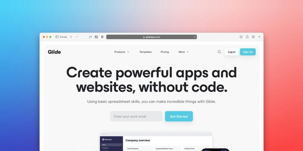
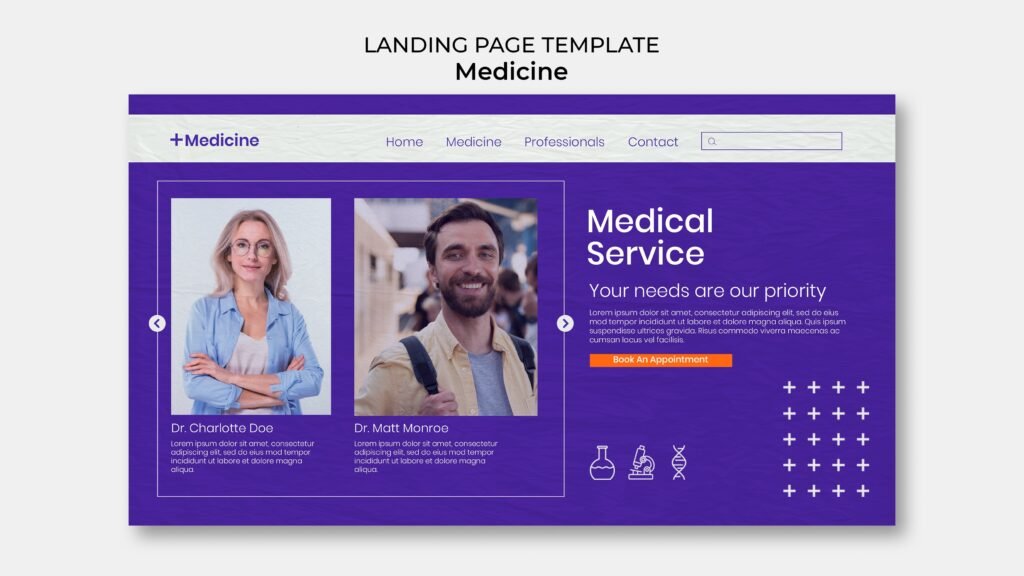
High-Converting Hero Sections: Anatomy of an Above-the-Fold WinHigh-Converting Hero Sections: Anatomy of an Above-the-Fold Win In modern digital marketing and website design, the hero section—the immediate visual canvas displayed on screen before a visitor scrolls downward—represents the most critical piece of digital real estate on your entire website. Whether an individual arrives on your domain via a high-budget Google Ads search campaign, a viral Instagram Reel, or an organic search result, their initial evaluation of your commercial capability occurs entirely above the fold. Independent eye-tracking research and digital consumer studies consistently reveal a sobering reality: you have roughly five seconds to convince a visitor to stay on your website. If your hero section is visually cluttered, conceptually vague, painfully slow to render, or fails to state what problem you solve, visitors hit the back button without hesitation. When a visitor bounces above the fold, your advertising budget is wasted, your search engine engagement metrics suffer, and your sales team is deprived of a qualified conversation. You can feature the most comprehensive portfolio, the most transparent pricing, and the most glowing customer reviews further down the page, but if the hero section fails to capture attention, those lower sections will never be seen. At The Tapi Media, we engineer high-conversion landing page architectures for ambitious corporate enterprises, healthcare practices, and regional service brands. In this masterclass, we dissect the anatomy of an above-the-fold win, outlining the exact psychological triggers, visual hierarchies, and call to action frameworks required to double your conversion rates. The Five-Second Attention Test: What Do You Solve? When an unfamiliar prospective customer lands on your website, their subconscious mind is aggressively filtering for immediate answers to three foundational questions: Question One: What specific service or product does this company provide? Question Two: Is this offering designed for someone like me? Question Three: What immediate action must I take to get started? The fatal flaw of failed hero sections is corporate ambiguity. Far too many business owners and graphic designers fill their hero sections with meaningless corporate slogans like Empowering Innovation for a Better Tomorrow or Excellence Redefined. These phrases sound poetic in a boardroom, but they communicate zero functional utility to an urgent customer. Your hero section must pass the five-second clarity test with absolute distinction: Direct Problem Solving Over Abstraction: State exactly what you do in clear, direct language. If you are an industrial automation firm in Gujarat, say We manufacture custom high-speed packaging machinery for FMCG plants. If you are a dental hospital, say Complete full-mouth dental implants and smile restorations in Surat. Identifying the Target Customer: Explicitly qualify your audience within the supporting text. Whether you serve industrial factory owners, growing retail boutiques, or busy working parents, naming your target demographic immediately validates their visit. H1 Headline Formulas That Stop Immediate Bounces Your primary H1 headline is the most prominent typographic element above the fold. It carries the heavy burden of stopping user scrolling inertia and commanding reading focus. A high-converting H1 avoids clever wordplay and focuses entirely on compelling value propositions. Implement these field tested headline formulas: Formula One: The Direct Desired Outcome Formula. State the exact ultimate benefit the client seeks, paired with an objection remover. For example: Scale Your Local Business Inquiries Without Wasting Money on Unqualified Ad Clicks. Formula Two: The Authority Definition Formula. State your specialized expertise combined with geographic or industry dominance. For example: Precision Industrial Gearbox Manufacturers Engineered for Heavy Heavy-Duty Manufacturing. Supporting Sub-Headline Framework: Immediately beneath your primary H1, place a two-sentence supporting sub-headline. Use this micro-copy to expand on your core methodology, state who you serve, and introduce your primary differentiator. Keep the typography clean, highly legible, and properly contrasted against the background canvas. Supporting Visuals: Real Product and Service vs Generic Stock Human beings process visual stimuli thousands of times faster than written text. The imagery supporting your headline either reinforces your authority or immediately shatters your credibility. The Catastrophic Failure of Generic Stock Photography: Nothing destroys website conversion rates faster than cheap, overused stock photography. When an Indian consumer visits an agency or clinic website and sees an awkward, artificial photograph of American actors in suits giving thumbs-up gestures around a whiteboard, trust evaporates. Users instantly recognize fake stock imagery, subconsciously concluding that your business lacks real facilities, real clients, and authentic capability. Deploying High-Impact Authentic Visual Assets: Authentic Product Demonstrations: If you sell industrial machinery, display high-resolution video b-roll or crisp vector renderings of your actual equipment in operation on a real factory floor. Authentic Clinical Environments: If you operate a medical clinic, feature your lead surgeons consulting inside your modern facility or reviewing 3D diagnostic scans. Dynamic Software and Interface Previews: If you provide web applications or technical services, showcase clean, beautiful mockups of your actual digital deliverables and client dashboards. Ensure all above-the-fold media assets are aggressively optimized. Convert images to modern WebP formats and compress video backgrounds to eliminate layout shifts and keep loading times under two seconds. Micro-Social Proof Placements Directly Below the Button A primary psychological hurdle preventing visitors from clicking your primary call to action is risk aversion. Prospective clients fear that clicking a button will trap them in an aggressive sales pitch or result in their inbox being spammed with endless unwanted marketing emails. De-risk the initial conversion step by placing micro-social proof triggers directly beneath your primary call to action button: Review Star Badges: Feature a compact, elegant visual strip displaying five gold review stars alongside an authentic rating metric, such as Rated 4.9 Stars Across 250+ Verified Google Reviews. Prestigious Client and Certification Badges: Position small, monochrome client logos, industry certifications, ISO badges, or corporate affiliations directly beneath your primary interaction zone. Reassuring Commitment Reducers: Include reassuring micro-text directly below the button, such as No Credit Card Required, Free 15-Minute Strategy Call, or Response Guaranteed Within Two Hours. These subtle signals dissolve final psychological hesitations, giving the user confidence to click. Friction-Free Primary Call to Action Styling Your primary call to action button
High-Converting Hero Sections: Anatomy of an Above-the-Fold Win Read More »